


4.1. Graphs and Charts
Read the chart, name its main pattern in an overview, then report a few grouped figures, one step at a time.
You should spend about 20 minutes on this task.
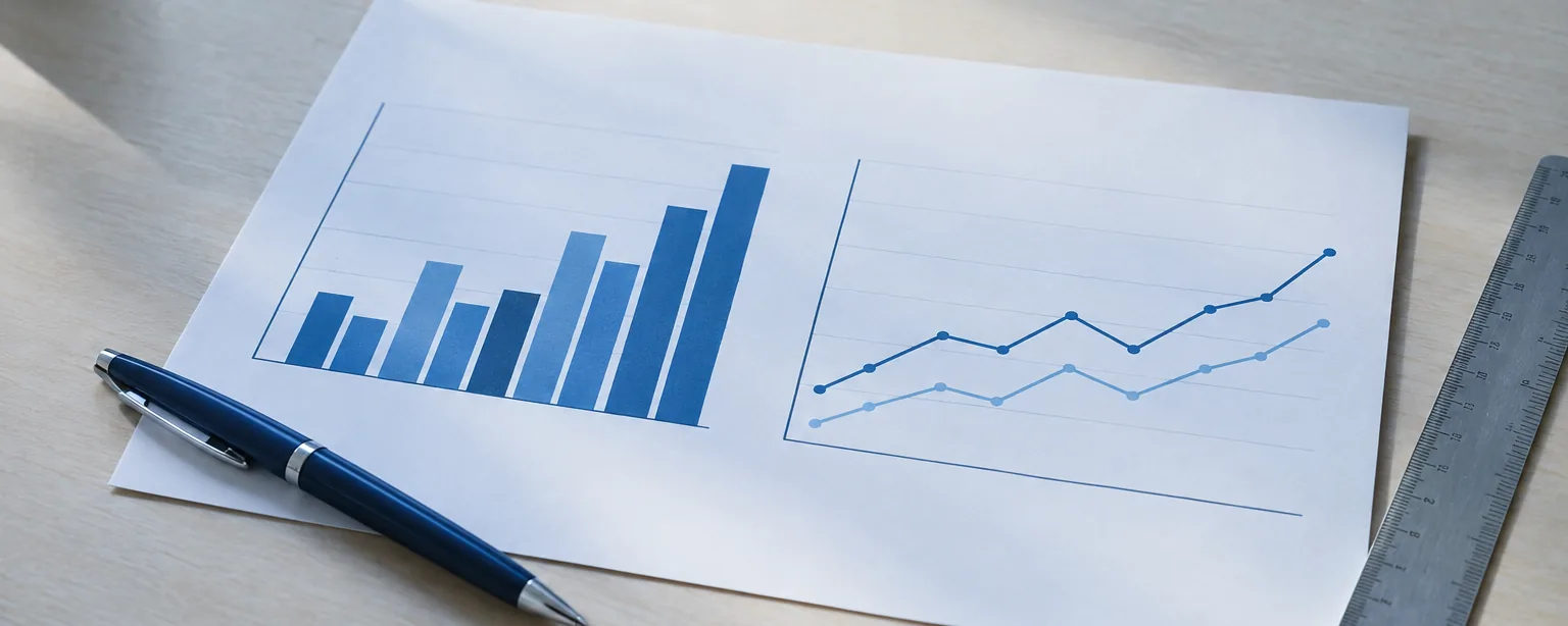
The chart below shows the average number of hours per week that two age groups in one country spent on five leisure activities in 2022.
Summarise the information by selecting and reporting the main features, and make comparisons where relevant.
Write at least 150 words.
The short version
You describe what a chart or graph shows: at least 150 words, in about 20 minutes.
An overview is one or two sentences that name the main pattern. Without one you lose marks.
Report a few figures, grouped and compared. Never every bar.
Say what the chart shows, never why. The reason is not on the chart.
What you have to do
The test shows one chart or graph with an instruction line above it. The line says what the chart shows and asks you to summarise the main features and make comparisons. You write a report of at least 150 words in about 20 minutes. It is marked on four things. First, whether it covers the task: an overview (one or two sentences naming the main pattern) plus figures that support it. Then how clearly it is organised, your vocabulary, and your grammar.
Overview against detail
An overview names the biggest pattern in the chart, in one or two sentences, with no figures or almost none. Detail comes after it: two short paragraphs, each with a few figures, grouped so that bars which behave alike are compared together. The examiner looks for the overview first. A report with no overview is held at Band 5 for task achievement, however good the English.
Step by step
- 1Read the instruction line, then the axes and the legend
The instruction line above the chart tells you what is measured, for whom, and when. On the chart above, it is hours per week, for two age groups, across five leisure activities, in 2022. Then find the unit on the axis and the groups in the legend. Note the unit and the year before you write a word.
- 2Decide what the task demands: an overview, then grouped detail
Every chart task wants the same two things. First an overview, one or two sentences that name the main pattern with no figures. Then two short paragraphs of detail with figures, grouped so that bars which behave alike sit together. On the chart above, ask which activities one age group led on and which the other led on. That split gives you the overview and the two groups.
- 3Paraphrase the instruction line in your first sentence
Your first sentence says what the chart shows, in your own words. Change the verbs and the nouns and keep the facts. For example, shows the average number of hours per week can become compares how many hours a week. In the same way, two age groups can become younger and older adults. Keep the year and the unit exactly as shown. Never copy the line word for word: copied words are not counted.
- 4Decide what to leave out
You will not describe every bar, and you will not explain anything. Choose the largest figure, the smallest, and the widest gap between the groups, and let the rest go. On the chart above that is three or four comparisons, not ten sentences. Never write because: the chart does not say why anyone watched television, and a guess costs marks.
- 5If you are stuck, use the fallback plan
Split the categories into two groups: those where the first series is higher, and those where the second is higher. Write one overview sentence that states the split. Then write one comparison sentence for each group, with two figures in each. That is an overview and two grouped paragraphs, which is a complete answer.
The older group spent far longer on three of the five activities. Television took them 18 hours a week, almost double the 9.5 hours of the younger group, and reading and gardening followed the same pattern, at 8.5 and 7.5 hours against 3 and 1. Younger adults, by contrast, led on social media, at 14 hours to 3.5, and on exercise, at 6.5 hours to 4.
- TaskThe paragraph opens with its group and its claim, not with a number.
- TaskA comparison, not two figures side by side.
- CoherenceReading and gardening are grouped with television because they behave alike, so three bars take one sentence.
- CoherenceOne phrase turns to the second group. No reason for the difference is offered.
Coloured text shows what the examiner is looking for.
Quiz time5 questions
Each drill gives you the figures or the sentence it needs, so nothing has to be looked up. Practise one judgement at a time.
Which sentence is an overview?
Read the figures, then choose the sentence that names the main pattern.
Read thisCinema visits per person per year. Under 25s: 6.0 in 2000, 5.5 in 2010, 4.0 in 2020. Over 50s: 2.0 in 2000, 3.0 in 2010, 4.5 in 2020.
Which sentence is the overview?
Spot the invented reason
Four sentences report the figures. One says something the figures cannot support. Choose it.
Read thisBottled water sales, million litres: 320 in 2015, 410 in 2018, 380 in 2021.
Which sentence contains the error?
Fix an opening that copies the prompt
This first sentence copies the instruction line word for word. Rewrite it in your own words, keeping the facts, the years and the unit.
Read thisInstruction line: The graph below shows the percentage of households with internet access in three countries between 2005 and 2020.
The graph below shows the percentage of households with internet access in three countries between 2005 and 2020.
Set up your learning path at the top of this lesson to get band-specific feedback.
Pick the figures worth reporting
A detail paragraph has room for two or three comparisons. Choose the figures to lead with.
Read thisVisitors to four museums, thousands, 2019 and 2023. Art: 410 to 420. Science: 380 to 610. History: 300 to 290. Maritime: 90 to 95.
Which two figures should the detail paragraph lead with?
Write one overview sentence
Write one sentence that names the main pattern. Use the past tense and at most one figure.
Read thisAverage hours of sleep per night, 2010 and 2020. Teenagers: 8.4 to 7.1. Adults aged 30 to 50: 7.0 to 6.8. Over 65s: 6.9 to 7.0.
Write the overview for these figures.
0 / 12 words
Set up your learning path at the top of this lesson to get band-specific feedback.
The full model
Below is a line graph with its introduction, its overview and one detail paragraph, written the way the five steps produce them. Read the overview first, then check each figure in the paragraph against the graph.
Check the unit before you write a number. The axis is in thousands, so 44 on the graph is 44,000 passengers.
The line graph compares weekday and weekend ferry passengers, in thousands, between 2016 and 2022. Overall, weekday travel was higher than weekend travel throughout, both lines fell sharply in 2020, and weekend numbers had almost caught weekday traffic by 2022.
The overview names the pattern. It does not list 40, 44, 18, 36.
Weekday travel rose from 40,000 to 44,000 passengers between 2016 and 2018, then dropped to 18,000 in 2020 before recovering to 36,000. Weekend traffic followed the same dip, from 28,000 down to 12,000, but then rose to 34,000 and almost matched the weekday figure.
- TaskThe 2020 fall is selected, not every small wiggle.
- TaskA comparison, not a list. No invented reason for the dip.
Coloured text shows what the examiner is looking for.
The same three categories, measured in 2015 and again in 2023.
Your turn to write2 questions
Your turn: overview only
Write one overview sentence for the ferry graph. Do not list every year.
Ferry passengers (thousands): weekday 40→44→18→36; weekend 22→28→12→34. Years: 2016, 2018, 2020, 2022.
0 / 12 words
Set up your learning path at the top of this lesson to get band-specific feedback.
Which sentence does the job?
Choose the sentence that reports the library chart.
Which sentence does the Task 1 job?
Tips
- Put the overview straight after the introduction
The examiner then meets it in the first minute. An overview saved for the end is easy to forget when time runs out.
- Check the unit before every figure
If the axis says thousands, a bar at 70 is 70,000. State the unit in your first sentence, then use it the same way throughout.
- On a line graph, read the shape first
Where does each line rise, fall or flatten, and where do the lines cross or pull apart? The crossing point is usually the main feature.
Recap
Read the instruction line and the axes first, then paraphrase the line in your own words.
Write an overview that names the main pattern, then two grouped paragraphs with a few figures.
Leave out the small figures and every reason. The chart shows what, never why.
Next: the other visual types you may be given.